
Wahoo - IPhone Powered Fitness
TLDR:
Redesigned Wahoo’s flagship app to combat rapid user drop-off by rethinking onboarding, emphasizing early value, and modernizing visuals—leading to a more intuitive experience aligned with brand goals and long-term retention.
The Problem
How might we modernize the iPhone Powered Fitness app to improve customer retention and bring the visual design in line with Wahoo’s updated brand?
The Actions
I investigated drop-off patterns, mapped user flows, and explored how small changes in onboarding, value delivery, and visual tone could create a more engaging first-time experience.
The Impact
By focusing on early value, optional signup, and clean, brand-aligned visuals, I proposed a direction to boost retention while positioning the app for long-term consolidation success.
Services
Data Analytics
UX Design
UI Design
Customer Journey Mapping
The Mission
Design is an ever evolving process. What worked splendidly a year ago might not be the best solution anymore. When this happens it’s time to update or terminate old products. This was the case for Wahoo Fitness’s flagship app, iPhone Powered Fitness. As part of an effort to downsize the number of apps they supported they decided to roll several of their old apps into a single new app. It was my responsibility to update the look and feel of these apps so that they could not only support our existing users but also help integrate new users into their fitness ecosystem.
Research
Analytics
As with most of my research I began this project by taking a look at the analytics that were embedded in the project. From this I could see that the app had a very serious problem with retaining users. I looked into the market average for app retention and most had a 75% fall off at around 3 months. The Wahoo iPhone Powered Fitness app had lost 75% of its users at around a week.
App Flow Analysis
One of my first steps in auditing the app was to take a look at the user flow. I went through and diagrammed every interaction, page and option in the app. This gave me an overall baseline to begin to understand the way the app was architected. This process helped me to understand in more depth what was obstructing the goals of the project. It also helped me make sure when I did the redesign I didn’t miss any central features to the app
Original App Architecture - YIKES!
Competitive Analysis
After I went through the existing app I went through its competitors and put together a presentation to discuss the strengths and weaknesses of our offering and those of our competitors.
After talking with the design lead I established the goals that would guide the project and measure success.
Goals
Update the user experience to include Cloud Sign Up
Redesign the interface to focus on providing value to both new and existing users
Update the existing visuals to better fit new brand style guidelines


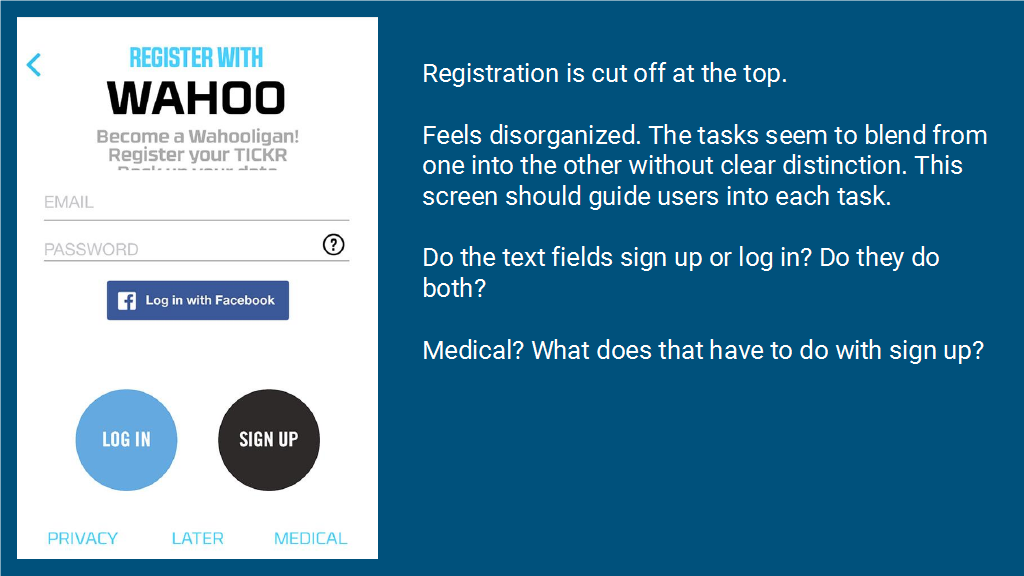


Cloud Sign Up

Flow Diagraming
The current implementation of the sign up flow only accounted for local storage. Since Wahoo would be moving to a universal cloud architecture iPhone Powered Fitness would also need to integrate into this. In designing the flow of this sign up I made a radical step away from Wahoo’s standard thinking at the time.
Don’t require Sign Up
I designed the flow to allow users to skip sign up altogether. I hypothesized that if users weren’t seeing value as it is then adding a barrier to entry would only encourage them to leave and use a competitor’s app. If users were allowed to skip this and instead begin using the app immediately we could get them into the action and seeing the value of an interconnected fitness world.
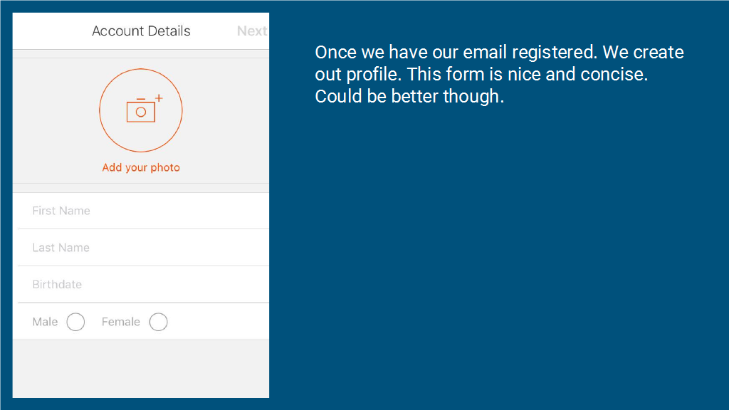
Visual Design
After some brief wireframing, I began to integrate the visuals from the marketing team and their branding guidelines. I worked to find a balance between the existing branding standards while also innovating and pushing the experience forward. Wahoo’s brand focused on bold and heavy typography which risked feeling bulky and cluttered. To counter this I opted for a minimalistic and clean UI that wouldn’t overwhelm users but instead invite them into the Wahoo universe. Additional design details like the bicycle illustration, were a delightful touch that helped enhance the experience and reinforce Wahoo’s expertise as a leader in professional cycling.


Workout History Screen
Design Iteration
The premise of this screen is fairly straight-forward. Review past workouts. The design however required nuance balancing a lot of moving parts to this screen in a small space.
How do you distinguish each workout from the others?
What how do you balance all of the data that needed to be displayed?
What will users need when reviewing their progress?
Starting once again with the brand guidelines I began to create iterations of the design. I experimented with groupings of data. As with the design of the sign up screen I pushed and pulled on the design language to not only fit what was expected but to go and try new directions and ideas including home page metrics and filters by activity
Filter Collapsed
Filter by Activitiy
Weekly Progress Tracking Concept